Dropbox gets a new look
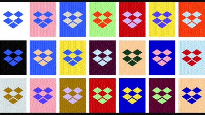
The new logo is a combination of bold colours and can be changed according to the situation.

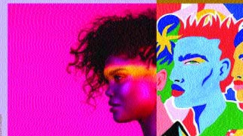
Dropbox has revamped itself after 10 years. This time, Dropbox has given itself a vibrant new look with a lot more colour in contrast with its former minimalistic white and blue design.
Dropbox now looks like the cool new kid in the world of file sharing. With this move, it hopes to stand out among its competitors such as Box, OneDrive and Google Drive. The company also thinks that the new colours will make its users more creative.
 Infographic
Dropbox says the logo colours can change based on the situation. “Our new system juxtaposes colour pairs in bold, unexpected ways. Colour is dynamic and playful — especially when it comes to the new logo, which can change based on the situation.” However, users are not sure what these ‘situations’ are.
Apart from these few obvious changes, most of the web and app user interfaces remain similar. It is still mostly white with blue and grey accents. The new colour combinations are more likely to be seen on marketing campaigns than actual interface changes.
The company said in an interview with a magazine that it will roll out more ad campaigns, which will be strategically placed in cities and neighbourhoods where creative people tend to live and work.
