Google Updates its 'G' Logo For First Time in 10 Years
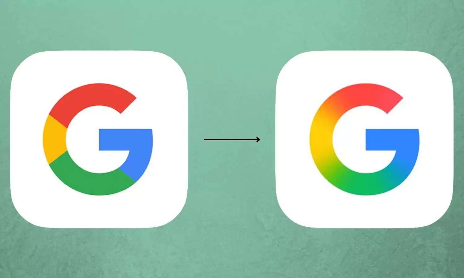
The new logo no longer features four solid color sections. Instead, the red, yellow, green, and blue now blend together into a gradient

Google Updates its 'G' Logo For First Time in 10 Years.
Search giant Google has updated its “G” icon for the first time in nearly 10 years.
The new logo no longer features four solid color sections. Instead, the red, yellow, green, and blue now blend together into a gradient.
Google previously updated its main “Google” logo to the Product Sans typeface on September 1, 2015. At that time, the “G” icon was also introduced with solid segments in the company’s signature colors.
Now, the updated “G” icon can be seen in the latest version of the Google app on iOS and Pixel phones. This new logo feels in line with the gradient that the company uses for its Gemini’s logo design.
As of now, the updated logo is visible only on iOS and Pixel devices. On other Android and web platforms, the “G” icon still appears in its previous form with solid color sections. However, it remains unclear if Google may change the logos of their other products.
( Source : Deccan Chronicle )
Next Story

