Navigating Through Art
Hidden from the conscious mind yet omnipresent to all, the subconscious art of wayfinding quietly asserts its influence guiding us effortlessly through our daily journeys

Ditch the GPS and have fun navigating the streets through an artistic gaze – the old clocktower, a cluster of colourful houses on the left, three stacked stones around the bend, a giant banyan tree in the centre, an old chai tapri at the crossroads — as landmark points to locate a particular place! Within these seemingly chaotic spaces in India whether on streets, natural trails or inside a metro mall lies the subconscious art of wayfinding. Striking a balance between intuitive navigation and individual discovery, wayfinding art is a visual indication through signage, textures, colour schemes, landmark sculptures, street art etc that help you navigate spaces and allow you to reach your destination effortlessly. Namita Jain, a Pune-based wayfinding and signage designer says, “It can be perceived as the art of wayfinding or a way of finding through art. People are constantly on the move and in such a hurry. We take time to read or write hence, we always take visual cues to help us navigate effortlessly and effectively.”
Ancient Wisdom
India’s history is intertwined with the evolution of navigation, from ancient pilgrimage routes to modern urban planning. The art of wayfinding is intricately woven into the architecture of India’s temples. Temples are often constructed according to principles of sacred geometry, aligning with cardinal directions and celestial bodies. The entrance (gopuram) often features elaborate sculptures and carvings, acting as both a decorative element and a navigational guide. The inner sanctum (garbhagriha) is strategically placed to capture the first rays of the sun during specific times of the year. This celestial alignment not only adds a spiritual dimension to the architecture but also aids in determining the time of day, contributing to the practical aspects of wayfinding within the temple premises. Wayfinding is not just about information systems but also about site-specific experiences where identification, direction, information, and regulation become one of the primary motives. Whether it is to read ‘No Smoking’ signs, footprints at metro stations or identify a happening place through its famous clock tower.
Modern Wayfinding
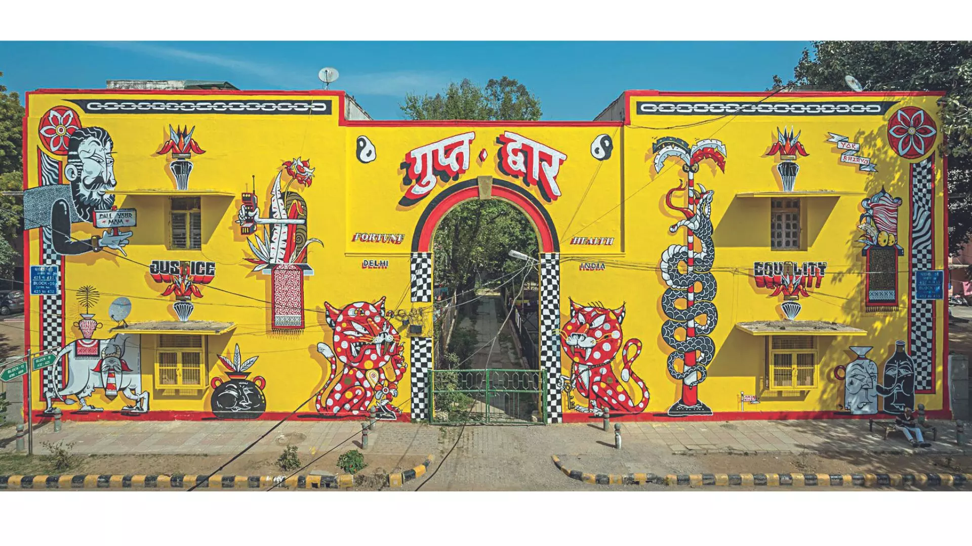
In contemporary India, the art of wayfinding has evolved to meet the demands of urbanisation. Cities like Delhi, Mumbai, Hyderabad and Kolkata are bustling metropolises where navigating the chaotic streets requires a unique set of skills. Street art, including colourful murals, graffiti... Public spaces are adorned
with street art that not only beautifies the surroundings but also serves as visual innuendo for navigation. The Lodhi art district in Delhi serves as a landmark for many where friends would mark it as a ‘meeting’ point.
Art And Beyond
The subconscious art of wayfinding is an amalgamation of conscious choices of materials involved, font and choices etc. Pulkit Sudan (30), a wayfinding and signage designer says, “Colours form the basis of designing artworks and graphics for wayfinding systems. We ensure that there’s enough contrast and legibility through basic colour theory. We also follow some cultural standards of what colour denotes danger or stop etc.” He emphasises the significance of the quality of material that is used in creating surroundings, “Suppose if a person comes to an unfamiliar city/place where all the signs are made of metal and painted in a warm colour like yellow, orange. Usually, people will see that as a warm sign however, a visually impaired person will perceive the city as a very cold place because it is made of metal. So you can change the material to make the person feel warmer, colder, sharper, or more soft based on the perception of that space.” This plays a very crucial role in indoor spaces as visually impaired people are self-reliant in indoor spaces as compared to outdoors where they are assisted.
Apart from colour and texture, even fonts play a key role in creating a seamless navigation experience. “There are certain guidelines which are based on legibility, and readability. The speed limit for drivers determines the font height and size on the sign board. Similarly, the height, position and angle of branded boards are kept in mind keeping the viewers in mind that will catch more eyes. And once you determine how tall the building is, you decide on legible and readable fonts,” says Namita. Different settings require different fonts. Fonts used for hotel rooms will be very different from public spaces that cater to a larger audience. Roadway sign boards are typically in green or blue due to international standards for road signs. Green is often used for directional signs, and blue is common for motorway or expressway signs, ensuring visibility and consistency.
Aesthetics & Functionality
Pulkit points out that wayfinding art is not the job of one person. It needs to strike a balance between functionality and artistic choices. As Namita says, “It is even to create navigational experiences that you just organically or through osmosis remember it now as.” Wayfind-ing art is registered subconsciously in everyone’s life where the idea is to build a memory and create a recall value for the same. A good wayfinding system is an amalgamation of conscious choices made by experts to create a seamlessly beautiful and functional navigation experience.
People are constantly on the move and in such a hurry. We take time to read or write hence, we always take visual cues to help us navigate effortlessly and effectively.” — Namita Jain, wayfinding and signage designer
Colours form the basis of designing artworks and graphics for wayfinding systems. We ensure that there's enough contrast and legibility through basic colour theory.” — Pulkit Sudan (30), wayfinding and signage designer

